Reviewing the Classics| Sleeping Beauty
Animation has often been described as “the illusion of life”—a trick of the eye that seemingly gives sentience to a series of drawings (or computer data in later years). As the art form has evolved over a century, the illusion aspect has enabled animators to break the bonds of earthbound logic and truly conceive whatever their minds can imagine.
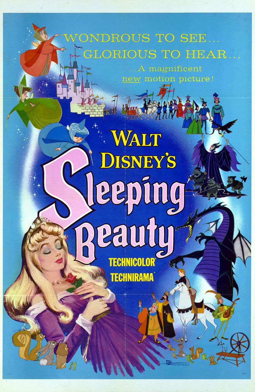
Such was the case with Walt Disney’s 16th animated feature, Sleeping Beauty. Celebrating its 60th anniversary this year, this film remains a timeless classic in the Disney canon. But it’s also an important film to the animation art form—helping take the medium into the next phase of its existence with a bold, pioneering design coupled with fluid, believable animation. Its artistry, craftsmanship, and storytelling have yet to be rivaled by anything that has been released since—Disney or otherwise.
The Moving Illustration
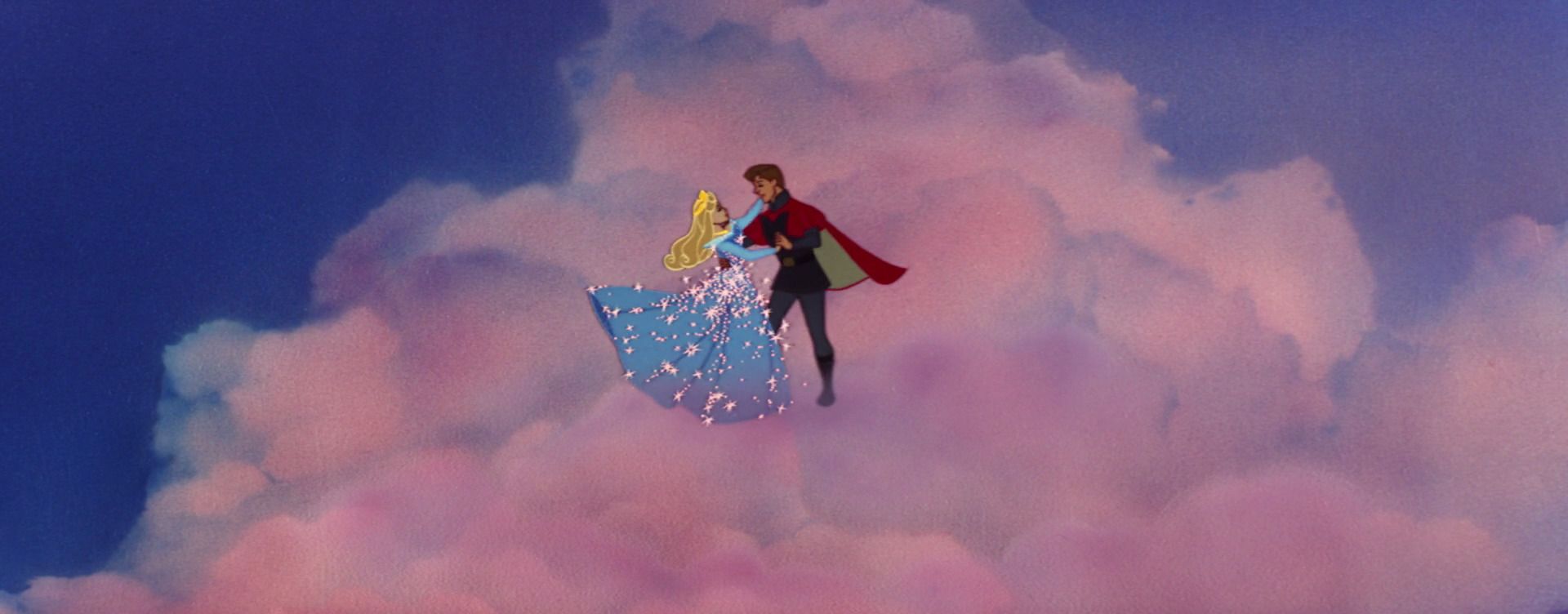
Sleeping Beauty is my favorite animated film for its boldness of design and superior animation techniques. On an artistic level, the film is an unmitigated masterpiece—perhaps the greatest Disney animated feature that has ever been created, if not the greatest animated feature, period. Put together like a fine piece of art, with exquisite visual details and nuances, it was the product of a studio at the top of its game and willing to experiment.
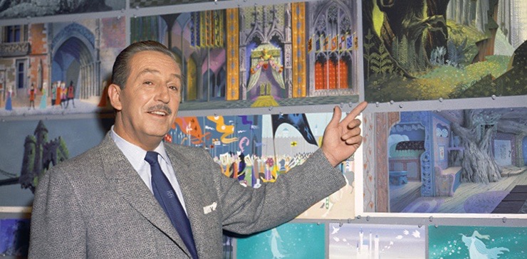
Sleeping Beauty was very different from its preceding Disney features by design, literally. Not wanting to repeat the styles of previous “princess” features like Snow White and the Seven Dwarfs and Cinderella, Walt Disney wanted Sleeping Beauty to be less focused on mimicking reality and more on creating a unique world. Hearkening back to the origins of the story itself (Charles Perrault’s first publication of the tale was from the 1690s), Walt envisioned the film as a “moving illustration” based primarily on styles found in medieval art.
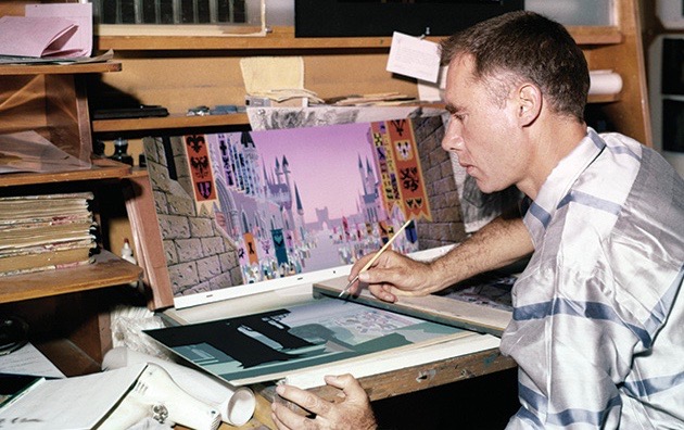
To bring his vision to life, Walt tapped Eyvind Earle, an artist with a very bold and distinctly modern style. Earle was able to synthesize the overly-detailed sensibility of medieval illustration with his own mid-century modern minimalism. To make this stylistic choice stand out more, Sleeping Beauty was shot in the widescreen Technirama 70mm format, which required the backgrounds to become wider and more detailed.
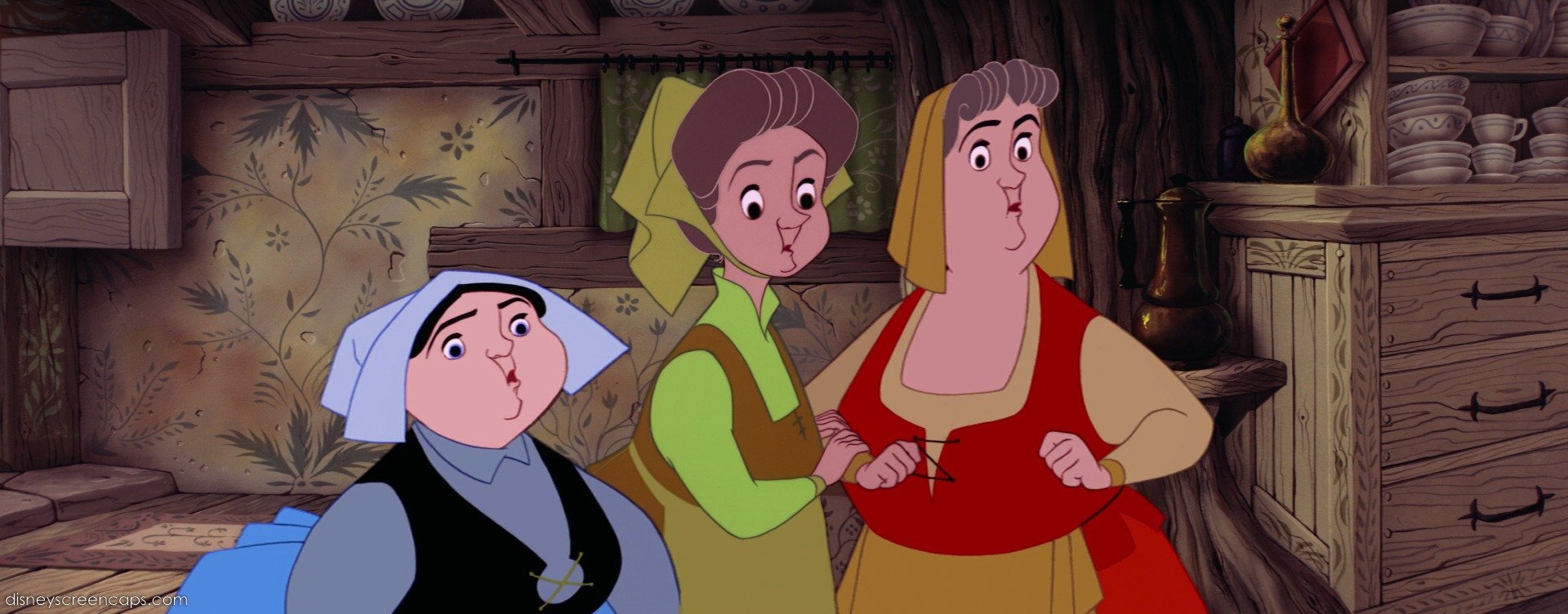
Earle’s influence also extended to the characters themselves, who were designed to match the hard, graphic backgrounds, but using fluid movement. In fact, the characters were designed contrary to the typical rounded, cuddly Disney aesthetic. The only ones who somewhat retained their roundness were the three fairies because of the broadness and humor inherent in the characters.
This was the era of the “Nine Old Men,” Walt’s top master animators and pioneers of the medium. They all worked on the film in some capacity and it shows in the superb character design and animation. Each character was given a distinct, understandable personality, and the acting is impeccable. And the film definitely has a lot of fun character moments—even more impressive considering the film clocks in at a brisk 75 minutes!
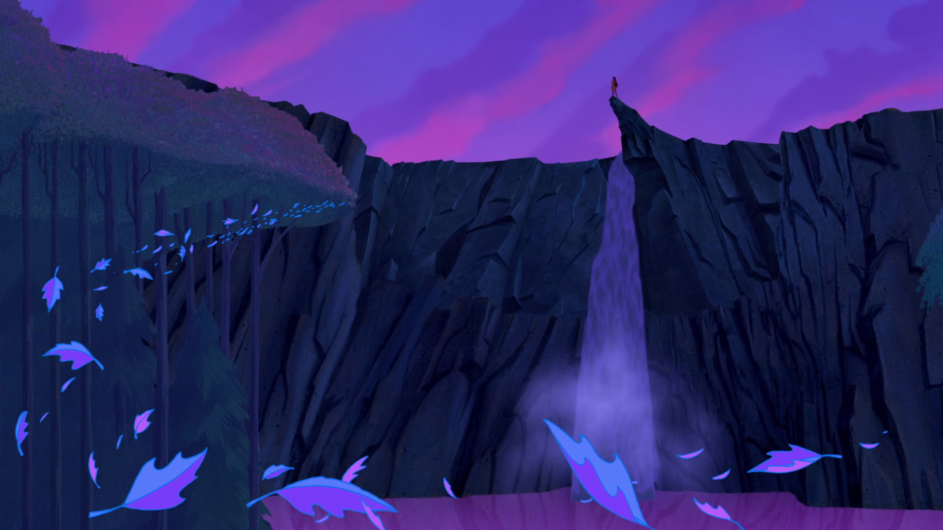
Because of this bold step toward stylization, Sleeping Beauty became one of the most influential films in the Disney canon. The more graphic styling encouraged future Disney animators and directors to branch out and make their films more visually distinctive from one another and even bring in a piece of the story’s culture as a visual influence. Modern classics like Aladdin, Pocahontas, Mulan, and Hercules have all gone the more graphic route, which made for more visually interesting films. Pocahontas‘ design, in particular, is seemingly a spiritual descendant of Sleeping Beauty’s bold style.
Two sequences from Sleeping Beauty epitomize the film’s artistic and storytelling excellence.
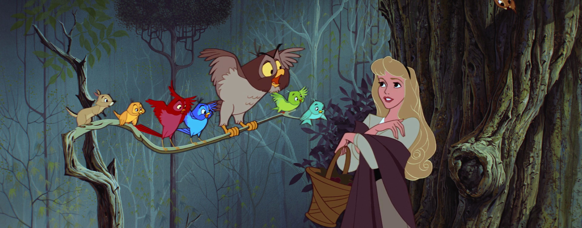
First is the forest sequence, which is beautiful on so many levels. The trees and bushes have a distinct vertical/horizontal paradigm. It’s a place that can only exist in animation (at least back then) and it’s amazing to think that all the art and visual effects were all done practically, by hand. The characters move, but they never look like they don’t belong within the scenery. The designs compliment each other. Put on top of that George Bruns’ magnificent score (adapted from the Tchaikovsky ballet of the fairy tale), a bunch of charming forest animals, and Mary Costa’s angelic voice, and this is truly an animated sequence for the ages.
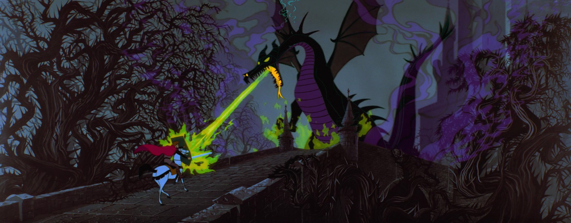
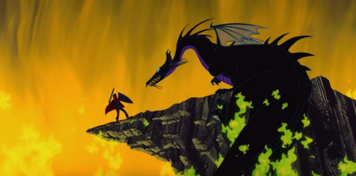
The second example is my favorite sequence in the film—the battle between Prince Phillip and the evil Maleficent as a ferocious dragon. Watching this whole sequence still amazes me to this day. The feelings of danger and dread are palpable. The action is tense, well choreographed and edited, and still maintains the rigorous design aesthetic, even in the fire effects. The movement of the characters, particularly the dragon, has weight and gravity to it—lending more credibility to the illusion. Like the forest sequence, it’s hard to believe that the dragon fight was executed so well in the days of pencils, celluloid, and paint. It’s as perfect as animation has ever been.
Horns and Thorns
Sleeping Beauty, like most fairy tales, is a morality play. The art superbly complements and enhances the film’s religious themes, partially due to its medieval influences. Most of the art done in the middle ages was of a religious nature, as the church itself was at the center of society. It’s no stretch to think that some of that religious influence made its way into the DNA of the film.
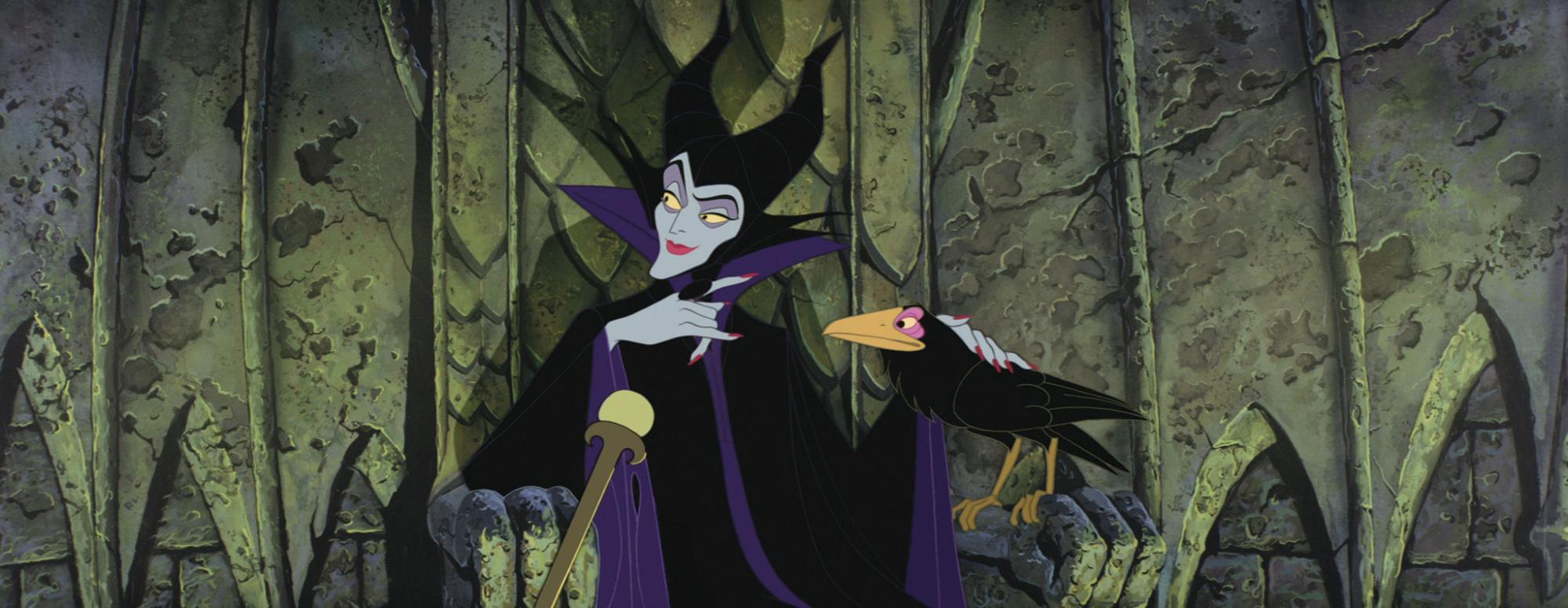
Now shall you deal with me, o prince, and all the powers of hell!
The strongest Christian allegory in Sleeping Beauty can be found, ironically, in the film’s villain, Maleficent. With her beautiful but dark visage, coupled with an outstanding performance by Eleanor Audley, Maleficent is one of the greatest Disney villains. She is self-described as “the mistress of all evil”—cunning, arrogant, with vast powers and a sizeable force of loyal minions at her disposal.
In other words, Maleficent is the devil.
The design of Maleficent deliberately invoked the satanic tropes of medieval religious art. Marc Davis, the legendary designer and supervising animator of Maleficent, researched medieval art and came across many depictions of demonic beings with horns. The flame patterns in Maleficent’s robes also came from these pieces of art.
“The thief comes only to steal, kill, and destroy…”
—John 10:10
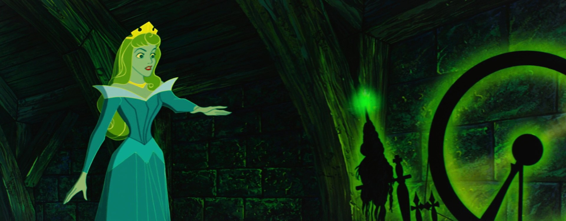
Satan and Maleficent do share other traits. They are driven by jealousy and the desire to destroy the one who is favored. Maleficent is relentless in her pursuit of the princess and lures Aurora into pricking her finger and falling under her evil spell.
In this analogy, we are the princess and Satan is doing everything in his power to make sure that we make our own “finger pricks” in life called sin, which separates us from God and can lead to spiritual death.
But all of Maleficent’s power could not stop Prince Phillip from reaching his betrothed and reviving her with a kiss.
O sword of truth, fly swift and sure, that evil die and good endure!
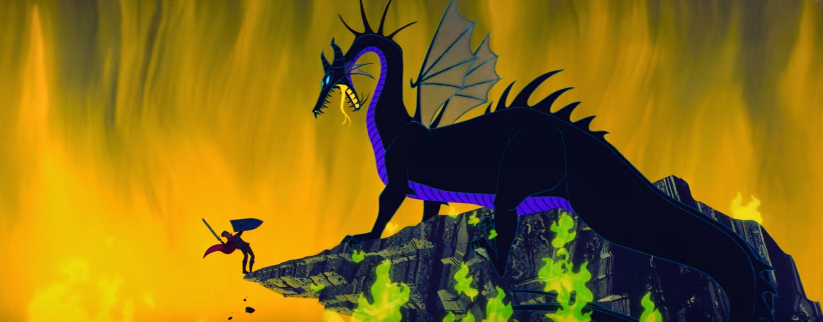
Another reason why the dragon battle is my favorite sequence of the film is that it is the spiritual apex of the story—an analogy of the gospel. The prince comes on a white horse carrying a shield of virtue (complete with a cross) and the sword of truth—termed as “weapons of righteousness.” He plows his way through a forest of thorns and fights what looks like an insurmountable foe. He is eventually triumphant, casting the evil one into a pit.
Sound familiar?
God loves us so much that He fought His way through death to be with us. He wore a crown of thorns and endured the cross to reach us, his beloved. Our Heavenly Father became a man to fight the battle we couldn’t. Rather than fighting the dragon, Jesus surrendered to him and took on the sin of the world. And with His death and resurrection, He has enabled all of us to come out of our spiritual deep sleep and be with Him for all eternity. We are the bride to Jesus’ bridegroom and are awakened, born again, by His sacrifice.
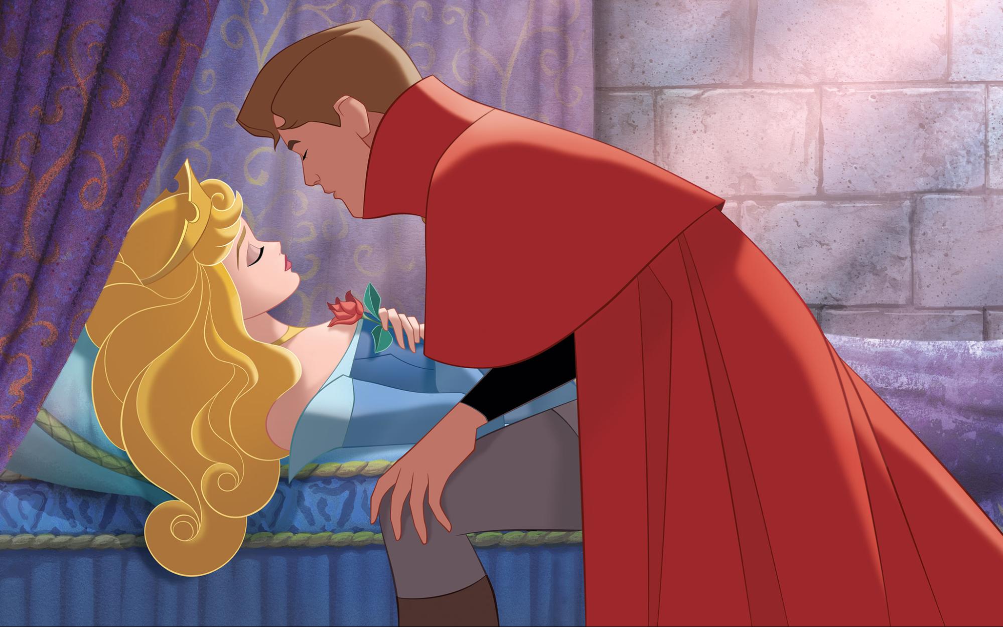
“For I am convinced that neither death nor life, neither angels nor demons, neither height nor depth, nor anything else in all creation, will be able to separate us from the love of God that is in Christ Jesus.”
—Romans 8:38
Beauty Awakens
Sleeping Beauty is a classic film of the highest order. Disney Animation has yet to top this influential and important film. In fact, this bold experiment was also a very costly one, and after its somewhat disappointing initial performance at the box office, Walt Disney opted to produce subsequent features in a less opulent way. However, they still invoked highly stylized visuals, like the film that came right after, One Hundred and One Dalmatians. Though Disney Animation turned out some amazing work in the years after its release, none can match the overwhelming artistry of Sleeping Beauty—and probably never will.
Sleeping Beauty is also rife with Christian allegory and iconography, no doubt partially a product of its artistic basis both in story and art. We are indeed living our own Sleeping Beauty tale, as we are caught in the middle of a battle between good and evil—a battle that has been won decisively by our Heavenly Father who loved us enough to endure pain and death. We can live a “happily ever after” with our Creator if we will accept his gift of life and be re-awakened to His glory and wonder.
